


.my_text
{
font-family: Arial, Helvetica, sans-serif;
font-size: 40px;
font-weight: bold;
}
* {
box-sizing: border-box;
}
body {
margin: 0;
}
/* Style the header */
.header {
background-color: #f1f1f1;
padding: 20px;
text-align: center;
}
/* Style the top navigation bar */
.topnav {
overflow: hidden;
background-color: #333;
}
/* Style the topnav links */
.topnav a {
float: left;
display: block;
color: #f2f2f2;
text-align: center;
padding: 14px 16px;
text-decoration: none;
}
/* Change color on hover */
.topnav a:hover {
background-color: #ddd;
color: black;
}
/* Create three equal columns that floats next to each other */
.column {
float: left;
width: 33.33%;
padding: 15px;
}
/* Clear floats after the columns */
.row::after {
content: “”;
display: table;
clear: both;
}
/* Responsive layout – makes the three columns stack on top of each other instead of next to each other */
@media screen and (max-width:600px) {
.column {
width: 100%;
}
}
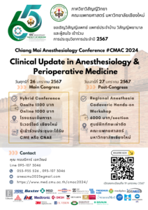
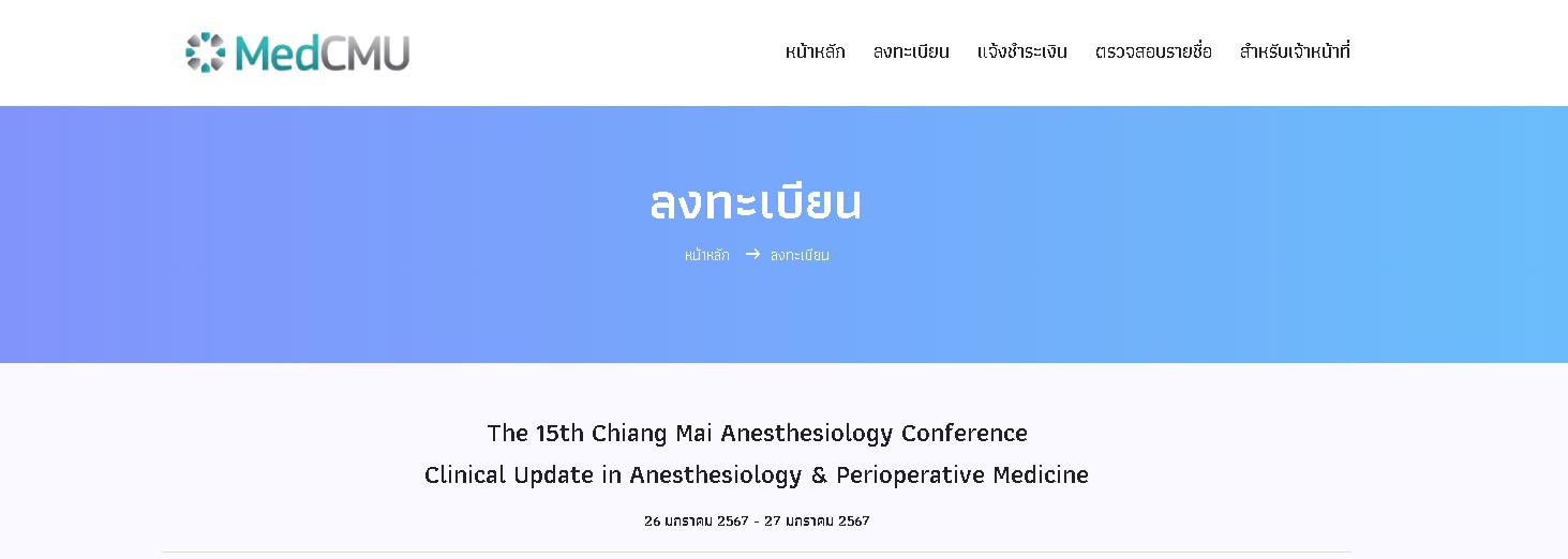
The 15th Chiang Mai Anesthesiology ConferenceClinical Update in Anesthesiology & Perioperative Medicine
Schedule
ลงทะเบียน
ตรวจสอบรายชื่อ

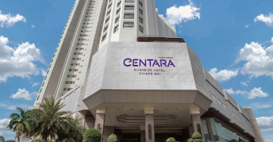
แผนที่โรงแรมเซ็นทารา ริเวอร์ไซด์ จ.เชียงใหม่
แผนที่ Cadaveric Surgical Training Center, ภาควิชากายวิภาคศาสตร์